
So you’re creating sites, libraries and lists in SharePoint, building some cool stuff on Wiki Pages / Web Part Pages? Guess what Cupcake?! You’re a developer. Just because some really clever people worked super hard and pre-built all the code in ‘behind’ that “create” button- doesn’t make you any less the ‘developer’ you are. AND it definitely doesn’t mean you have to worry less about the final product.
Time to build: n/a
Audience: SharePoint End User and Super User (and pretty much anyone who creates presentations / brochures etc.)
(End User, Super User, SharePoint Designer, SharePoint System Administrator, Web (.NET) Developer)
Level of fun: Relaxing Fun
(Challenging, Accommodating, and Relaxing Fun)
Some definitions:
developer
[diˈveləpər]
NOUN
a person or thing that develops something
graphic design
NOUN
the art or skill of combining text and pictures in advertisements, magazines, or books
Hmmmmmm, very interesting indeed. Neither of those definitions says anything about qualifications, years experience or any other prerequisites for that matter.
I am not a qualified developer or graphic designer, however – I create beautiful things everyday – SharePoint + Office (Microsoft) has given me all the tools I need to do this.
In this blog I’ll share my personal experiences, tips and tricks which I consider my design principles. I’ve also added a lot of “need to know” and terminology. Based on practice not theory – I suggest not using these for professional web design (UX / UI), but rather as input for aspiring designers who think they can’t use colours or that they are disadvantaged as they do not have access to some of the (expensive) software available on the market.
Colours:
Most people can’t put two colours together (and make it work) to save their lives. But never fear when the web is near. The most complimentary colour is found directly opposite on the colour wheel. For example – building a site / page where the overall colour is Turquoise – use a dash of Red with it. The Triadic Colour Scheme can also be used. See images below to illustrate:

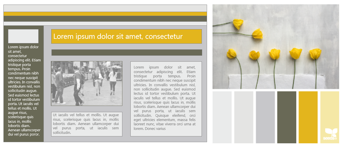
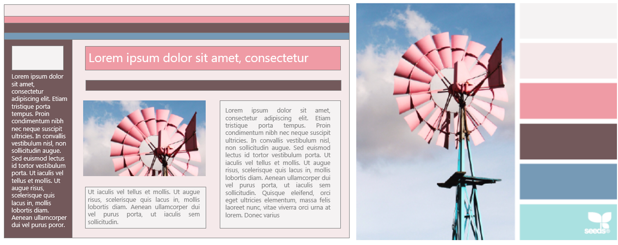
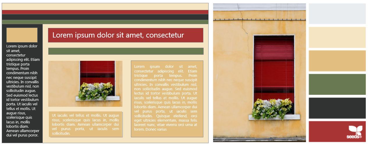
Picking a group of colours to use together might be a bit more tricky. I use Design Seeds to inspire me when I’ve run out of ideas. Hovering over the colours on the right of the image will give you the Hex colours (as used on SharePoint). In the example below I picked a compilation on Design Seeds and pasted the screenshot in PowerPoint. I then added shapes to create a mock-up of my new page. In Microsoft Office 2013, you can use the colour picker to fill the shapes with exactly the same colour (from the screenshot). If you don’t have 2013, you can paste the image in Paint and then use the colour picker to get the RGB of the colour you would like to use. See my blog The lighter side of Microsoft #5: Be more creative with Microsoft Office for more details on how to do this.
I tend to use a 70% mix of the lightest and second lightest colour, 20% of a darker shade and a 10% mix of an opposite / contrasting colour.
Do not underestimate the Psychological Effects of Colour. Ever seen someone dressed in cheerful orange or yellow at a funeral? Click here to read a great article + infographic on the WebpageFX Blog – Psychology of Color. Using the wrong colours can have a huge impact on how people perceive your site / page as well as user adoption.
RGB, HSL, HEX:
There are three ways of declaring colours in CSS: HEX, RGB and HSL. RGB (Red Green Blue) and HEX (# in the colour code) defines the colour, where HSL (Hue, Saturation and Lightness) allows you to add to the Saturation and Lightness to the Hue (colour). See W3Schools / W3C. Click here for a nifty HSL to RGB / RGB to HSL / Hex Colour Converter.
HTML and CSS:
According to The World Wide Web Consortium (W3C) – HTML (the Hypertext Markup Language) and CSS (Cascading Style Sheets) are two of the core technologies for building Web pages. HTML provides the structure of the page, CSS the (visual and aural) layout, for a variety of devices. Learn more here.
CSS provides many different units to specify length. They fall into two groups:
Absolute units of length such as inches, centimetres, millimetres, points, and picas as well as relative units such as ems, exes, pixels, and percentages. On Translatorscafe.com you can find this Typography and Digital Imaging Units Converters.
Size:
Currently the average screen resolution is 1366 x 768 (pixels). When not designing responsive sites, this is very important to keep in mind. For example: Should you add an image (non responsive) on a wiki page, it would be advisable not to load and image bigger than 1366 (Width) x 768 (Height). Note: A responsive site (RWD) site will adjust, photos will resize, text and other elements may change position to respond to the height and width change of your browser.
Image sizes:
For a page to load as fast as possible, it’s important to keep an eye on your image / photo sizes. You might want the quality to be as high as possible, but if your page (site) takes a couple of seconds to load (open) it will not be worth it. To resize images, see my blog The lighter side of Microsoft #17: Cause everything I love I call “Wedwo” which explains in detail how to use Microsoft Picture Manager to resize, compress and crop images.
Fonts:
All I can say is that I stay as far away from curly, funny, glittery fonts as possible. I’m really ‘font’ of Segoe UI (I’m such a Microsoft Babe) – but keep in mind that it’s not available on all systems. Here are some CSS Web Safe Font Combinations and a Default List Of All Web-Safe-Fonts With Their CSS

Well, that’s all for today. I hope these simple tips will help you create some beautiful sites / pages / presentations going forward.
Leave a Reply