
#Office365Challenge – Excel – Area Charts. The next couple of posts will be all about the charts available in Excel. Today we’ll look at Area Charts
| Day: | 106 of 365, 259 left |
| Tools: | Excel |
| Description: | Area Charts in Excel |
Highlight the data you want to include in your graph – this should include row and column headings. The title of he graph is never included, it should be added manually.
Click on the Insert Tab (1) and Under Charts click on the Area chart dropdown (2), select the type of chart you would like to use. The options include 2-D and 3-D Area charts. Go to more Area charts (3) for more options:

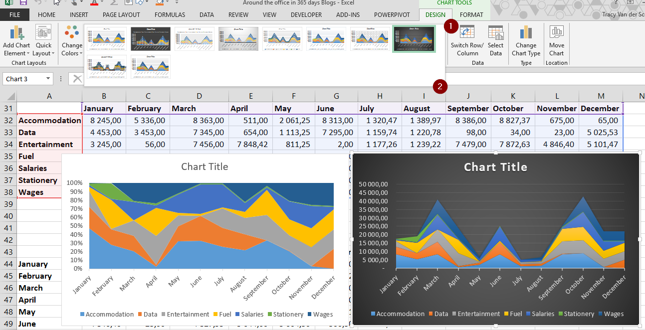
Keep in mind once the chart is inserted, you can click on the Design Tab (1), then click on the Chart Styles dropdown to change the style of your chart:
See you tomorrow for more on Combo Charts in Excel.
Overview of my challenge: As an absolute lover of all things Microsoft, I’ve decided to undertake the challenge, of writing a blog every single day, for the next 365 days. Crazy, I know. And I’ll try my best, but if I cannot find something good to say about Office 365 and the Tools it includes for 365 days, I’m changing my profession. So let’s write this epic tale of “Around the Office in 365 Days”. My ode to Microsoft Office 365.
Keep in mind that these tips and tricks do not only apply to Office 365 – but where applicable, to the overall Microsoft Office Suite and SharePoint.
1 Pingback