#Microsoft365 #Office365 #SharePoint – It truly is one of the sexiest web parts released for SharePoint in a loooooonnnnnggggg time. Seriously overdue, but thanks Microsoft. So let’s take a look at how to make the most of your Hero Web Part, I’ll also share some creativity hacks you might not have thought of.

For previous posts in my #Microsoft365Challenge go to the index page.
DISCLAIMER: I WRITE ARTICLES ABOUT OFFICE / MICROSOFT 365. CONTENT IS ACCURATE AT TIME OF PUBLICATION, HOWEVER UPDATES AND NEW ADDITIONS HAPPEN DAILY WHICH COULD CHANGE THE ACCURACY OR RELEVANCE. PLEASE KEEP THIS IN MIND WHEN USING MY BLOGS AS GUIDELINES.
What does Microsoft say?
The Hero web part is a great way to bring focus and visual interest to your page. You can display up to five items in the Hero web part and use compelling images, text, and links to draw attention to each. The Hero web part is included by default on Communication sites, but you can also add the Hero web part to other pages. Use the Hero web part.
Depending on the design you chose to build your site – the web part might look a bit different:
Showcase:
The Showcase design’s hero web part added by default is layered (as opposed to tiles in Topic Design). When you edit the web part you’ll notice that you can change between Tiles and Layers and also choose number of layers:

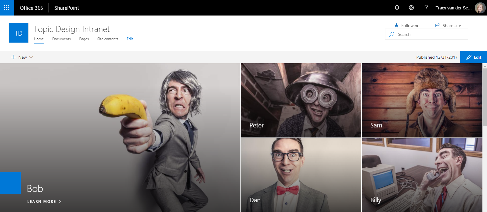
Topic Design:
For Intranet type sites, I prefer this web part. I’ll keep saying this. Sexy as can be and fully responsive on mobile devices. I know. I think I’m in love….

Let’s take a look at configuring this web part. You’ll have to put the page into edit mode. Take note that you can edit the whole web part (top left) or edit each of the blocks (bottom right corner of block):

When editing the web part, you’ll notice that you can change between Tiles and Layers and also choose how many tiles to show. I prefer 5 as that fully utilizes the space on the landing page:

These 5 blocks can have any image and point to any URL (internal or external, website or document).
You can choose to display an image or Color only (picked up from the theme you chose for the site).
Edit the Web Part to:
- Change the URL
- Add the Title
- Choose and Image
- Or use Color only
- The biggest block of the 5 allows us to add Call to action text
If you put ugly images in there that don’t work well together – it won’t look nice. The awesome web part won’t save the day. Here’s some sites to get images from (royalty free, non copyright):
Tip: Keep your images as small as possible (MB not dimension). Images below 500kb load much faster.

Some creativity hacks:
Take a screenshot of any “other” colors and add as an image instead of using the default theme color block:

Use same color / type of images to work together. Great idea for campaigns etc.

Find similar images that ‘tell your story:

Use it to introduce your team with links to their Delve pages:
Use a GIF in one of the Image blocks:
Create a GIF using one of the many free website tools. You can read more in this blog of mine.
Conclusion:
Promise me you’ll have some fun?! Try new things, live a little. Life is not supposed to be boring 🙂
Purpose of this blog challenge: I will write 365 blogs in 365 days around Microsoft 365. I did a similar challenge with Office 365, blogs can be found here. I won’t just be talking about the new Microsoft 365 subscription model. I will be sharing any news, tips and tricks around Office / Office 365 / Windows / Mobility and Security. And let’s not forget all the great new Apps & services available. A lot of what I’ll share on Office and SharePoint will also be applicable to none “Office 365” versions.

January 15, 2019 at 3:18 pm
Hi, you mentioned the photos should not be too large – but on the other side, which pictures are too small? Is there an optimal size of the photos in Hero web parts, but also within News banner etc…I am aware of photo ratio, but I m thinking about optimal dimensions in pixels, not MB because I am considering to sites to get images from (paid ones) and picture size make diffrence in price range. Thank you in advance!
January 15, 2019 at 4:32 pm
So yes MB is what I was talking about for page load. You can compress (mb) images in PowerPoint to reduce size before loading. Regarding pixel size: this is gonna sound crazy but set your resolution to highest. Then work out the width of the biggest image in the hero web part. I would guess that at half the width. My pc is set to 2256 so the image would be about 1128 px wide for good quality. Make sense? The image will never be wider that half the resolution pixel width on pc’s. On mobiles they’re even smaller. Of course that’s if you use 5 blocks. 3 blocks would be 2 thirds width and of course one block is full page with.
January 15, 2019 at 3:25 pm
And another question…. Hero web part looks amazing thanks to viusals , but for what kind of content do you use them in a Communication site? Is it better to use them for campaigns or news? I would like to use them for the latest news articles because they get the most attention from the readers, but then, why would I need the News web part? And finally, let`s say a reader needs to catch up with the last 10 news.. He can go to News webpart and find all news listed, but If i use Here web part for News, they won`t be able to find more than 5 latest news? What would you reccomend?
January 15, 2019 at 4:40 pm
I don’t think I’d use it for news. I’d rather use the news web part. It’s not dynamic. I use this more on Intranets to go to policies and departments etc. Or meet your employees. You could add the news web part next to a 3 block hero web part but then you lose full page capability.
July 22, 2019 at 6:09 pm
Hi Tracy – do you know if additional, smaller tiles can be embedded in each larger tile? That is, when hovering over a large tile, can four smaller, clickable tiles be displayed?
July 27, 2019 at 8:47 am
Hi Jason. Not OTB. But I’m sure with some code anything is possible. Not advised in my opinion.
April 3, 2020 at 6:30 pm
HI Tracy, thanks for the tips. I was looking for a way to BOLD or ENLARGE text on the hero web part. I haven’t found it, but the “use an image of a colour block” idea may solve the problem. (The problem being that my client doesn’t think the hero web part text is very readable.)
Cheers!
Gerry
P.S. Are you going to Branson for NACS this year?