
#Office365Challenge – Creating Scatter and Bubble Charts in Excel are super fun. Yes, yes, I think they’re cute. I’m so used to column and pie charts that these type of charts are quite refreshing, and no, I am not trying to diminish the power these charts can have.
| Day: | 109 of 365, 256 left |
| Tools: | Excel |
| Description: | Creating Scatter and Bubble Charts in Excel |
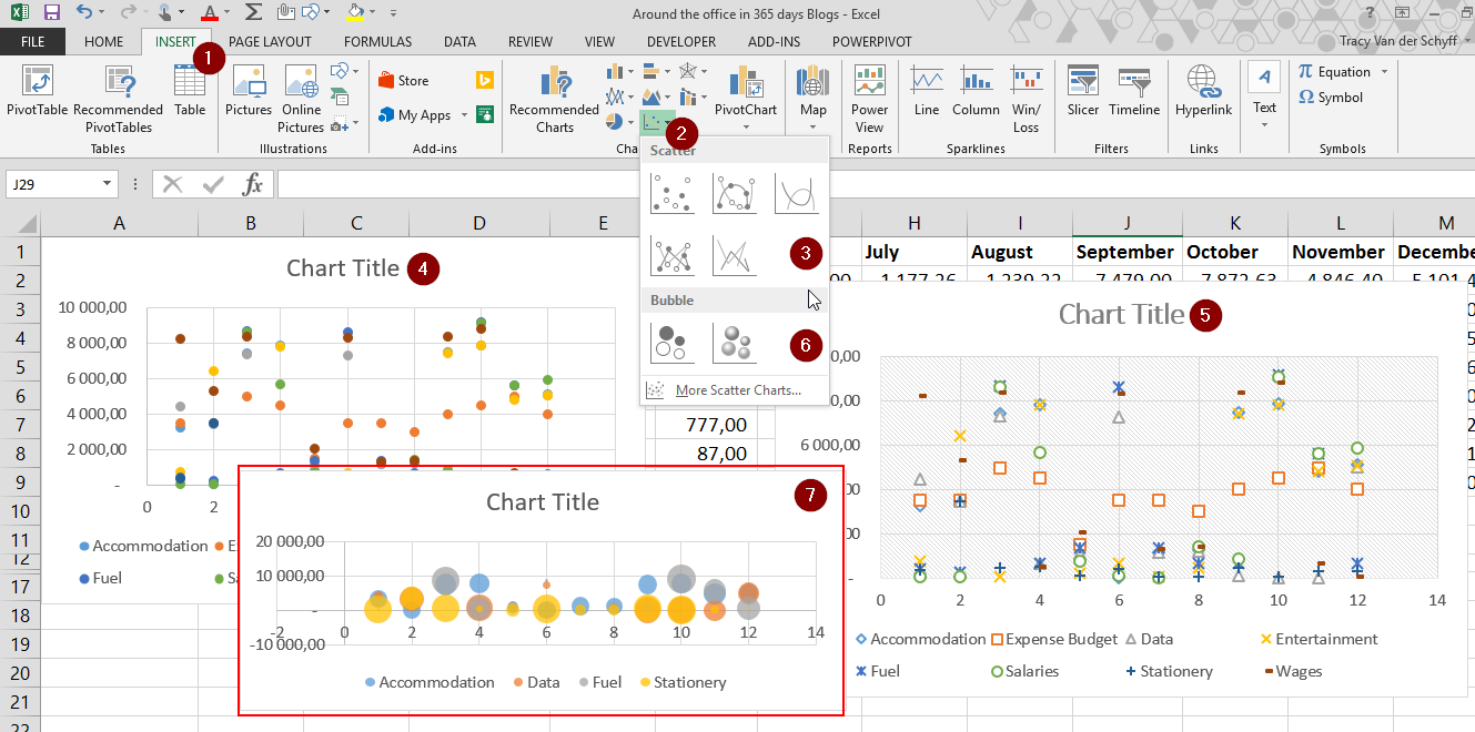
To insert a Bubble or Scatter chart:
Highlight the data you want to include in your graph – this should include row and column headings. The title of he graph is never included, it should be added manually. Click on Insert (1), then open the (2) Scatter or Bubble Chart Dropdown. Here you can select whether you want to use Scatter charts (3) which look like number (4) and (5) or Bubble charts (6) which display as (7).
Take a closer look at (5) – the chart has assigned tiny symbols to each of the data types – I think that’s pretty awesome!

This wraps up a week of blogging about the charts in Excel. I hope you’ve learnt something, cause I surely have!!
Overview of my challenge: As an absolute lover of all things Microsoft, I’ve decided to undertake the challenge, of writing a blog every single day, for the next 365 days. Crazy, I know. And I’ll try my best, but if I cannot find something good to say about Office 365 and the Tools it includes for 365 days, I’m changing my profession. So let’s write this epic tale of “Around the Office in 365 Days”. My ode to Microsoft Office 365.
Keep in mind that these tips and tricks do not only apply to Office 365 – but where applicable, to the overall Microsoft Office Suite and SharePoint.

1 Pingback