 #Office365Challenge In this Sway post, we’ll be looking at how much the Layout affects your Sway presentation.
| Day: | 304 of 365, 61 left |
| Tools: | Office 365, Sway |
| Description: | How to use Layouts in Microsoft Sway |
| Audience: | All |
Day 4 of my Sway journey and we’ve covered the menus, images, using groupings and inserting Tweets, Videos & Embedding Code. Today I’d like to focus on using the different layouts to achieve the best results.
In Sway there are 3 layouts we can use. Below I’ll show you short videos (less than 60 seconds) of how the different layouts affect the display. Keep in mind my Sway is far from finished as I still have lots of text and headings to add. The Sway is also not published yet (Shared), so the preview mode can be a bit ‘sticky’ / slow.
Layout 1:
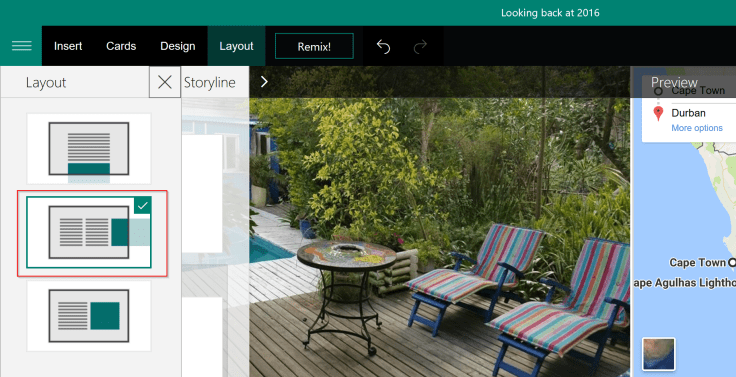
This layout is a scroll down layout. I think this will work great for brochures and newsletters. It also focusses much more on full size images:
Sway in Action:
Layout 2:
This layout scrolls to the right, it does sneak previews of the next page by bringing it in as columns:
Sway in Action:
Layout 3:
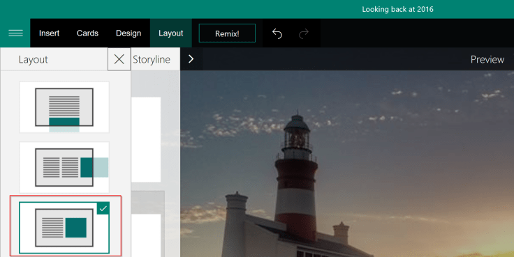
This layout also scrolls to the right, with more entrance animations. This will be my preference for what I want to achieve:
Sway in Action:
Tomorrow I need to work on my design and finish up adding any text and headings, see you then.
Resources / related posts:
- Microsoft Sway
- What is Sway – Office Sway Vision Video
- Microsoft Sway Hands On Review!
- Frequently asked questions about Sway – Admin Help
- Sway is not replacing PowerPoint: The real story
- Day 301 – Creating your first Microsoft Sway Presentation
- Day 302 – Working with Images in your Microsoft Sway
- Day 303 – Using Media in Microsoft Sway
- Sway content limits — free vs. Office 365
Overview of my challenge: As an absolute lover of all things Microsoft, I’ve decided to undertake the challenge, of writing a blog every single day, for the next 365 days. Crazy, I know. And I’ll try my best, but if I cannot find something good to say about Office 365 and the Tools it includes for 365 days, I’m changing my profession. So let’s write this epic tale of “Around the Office in 365 Days”. My ode to Microsoft Office 365.
Keep in mind that these tips and tricks do not only apply to Office 365 – but where applicable, to the overall Microsoft Office Suite and SharePoint.


Leave a Reply