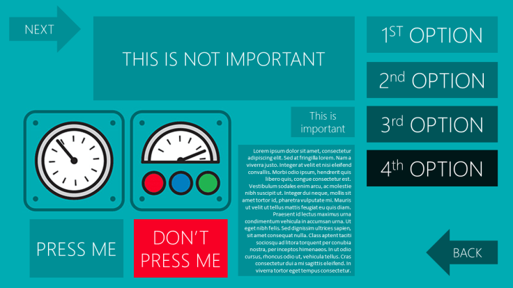
#42WeekHitchhikersGuide – Today we’ll chat about Intuitive Design and the importance thereof in the complex journey to achieving greater User Adoption. You should spot at least 5 rookie mistakes in my mock-up design
Week: 3 of 42, 39 left
This week’s best line from Douglas Adams’ The Hitchhiker’s Guide to the Galaxy Series: “A common mistake that people make when trying to design something completely fool proof is to underestimate the ingenuity of complete fools.”
Again so funny that the best quote from the book today talks about design. BUT I don’t necessarily agree with categorizing people as “complete fools”. I’m too much of a MicroSoftie to ever do that 🙂
I would much rather rewrite that as “A common mistake that people make when trying to design something completely fool proof is to underestimate the complexity of human nature.”
Moving along swiftly then…. 🙂
Intuitive Design:
What is Intuitive Design?
in¦tui|tive [ɪnˈtjuːɪtɪv]
ADJECTIVE
1.using or based on what one feels to be true even without conscious reasoning; instinctive:
Opening Disclaimer: I am not a designer, UI/UX/CX specialist. I have built many solutions, landing pages and I have made many mistakes. I train users to use systems and therefor I am also a user of systems. My opinions are based on feedback I receive, research I do and in general on my stubborn nature to not just accept statements as a given.
Often at conferences I would get involved in ‘passionate’ discussions around training and the need for it. “Surely if a system is intuitive enough, training becomes obsolete? If a 2 year old can use an iPad without training, then we’re doing something wrong.” This got me thinking, and actually started the journey around my Digital Literacy research. Could there be any truth in this?
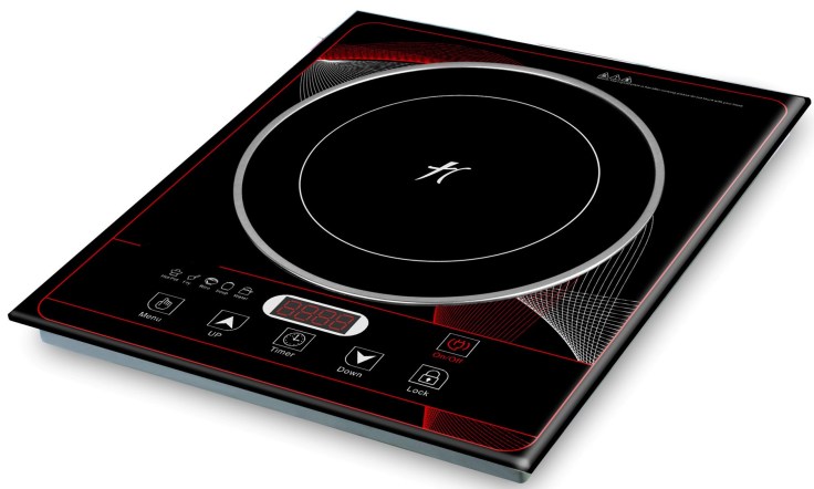
The example I would like to use is an Induction Cooker.
“Induction cooking heats a cooking vessel by magnetic induction, instead of by thermal conduction from a flame, or an electrical heating element. Because inductive heating directly heats the vessel, very rapid increases in temperature can be achieved.” (Wikipedia, Induction Cooking, n.d.)
In summary:
- Sleek Design
- Instant Heat
- No Waste
- 70% More Efficient
- Safety
- Easy to Clean
You can touch the plate and it will not burn your hand. Wow!
Would you do it?
Nope, but a 2 year old will. Because they’ve never burnt their hands on a stove before (hopefully). And eventually you’ll do it too, because someone told you – which then makes it ‘familiar’.

So designing interfaces that are intuitive to use should normally includes an experience that seems familiar, which leads to doing without thinking. This is not entirely possible when dealing with users who have different levels of experience on a wide range of systems.
Of course it becomes more intuitive, as users become more familiar with it. What I am asking of you is to not disregard the importance of training, because you consider your system intuitive.
Younger users, with less ‘system muscle memory’ will adopt new systems faster. Eventually when all users have a better digital literacy foundation, and have become better at ‘self learning’ it will get easier. But we are a long way from that.
Let’s get back to what makes an User Interface intuitive:
In this Summary of Don Norman’s Design Principles the following principles are highlighted for design:
- Visibility
- Feedback
- Constraints
- Mapping
- Consistency
- Affordance
I’ve ‘made these my own’ and will explain my understanding of each in layman’s terms:
Visibility:
Make important functions more prominent. This can be used with size, colour etc. An example I love to use is an ATM. Have you noticed how when it asks you whether you want a receipt or not, the preferred choice would be highlighted in a brighter colour. “No” would be in bright red, “Yes” would be grey. Of course not printing receipts saves the bank money. Visibility can be used to drive preferred outcomes as well.
Feedback:
How does the system interact with the user after successful and failed attempts at doing something? Are there any changes to the screen, does the user know that something has happened and they can proceed?
Constraints:
These of course refer to actions that should not be happening. A user closing the screen while busy with a transaction should prompt to confirm and explain the consequence. Actions available but not for use at current time should be greyed out and not clickable. Etc.
Mapping:
Think icons. A tick means yes, a cross means no. Up and down arrows. Smiley Face vs. Frowning Face. The battery icon with different number of bars to show empty or full. When you start taking note of these, you’re realise how sneaky and genius it is – as this is exactly where familiarity comes in.
Consistency:
Buttons (icons) for specific functions should stay the same throughout the system. Back and Next buttons should always be in the same place (where it makes sense). Search bar always top right for example. For me consistency also speaks to fonts and colours used. Size of images and banners. Menu sizes and placements.
Affordance:
Affordance is about giving clues. Very similar to Mapping above. The icon could be self explanatory and inviting. Hover over explanations is also an example. Buttons which are shaded and looks clickable, will be clicked.
I would add:
- Simple
- Responsive
- Attractive
And finally why is User Adoption so important?
Do you like spending hours in front of the stove, cooking a lovely meal, and have no one eat it? Nope. Neither do I. Ok I don’t cook – but I’ve heard people say this.
However user adoption is NOT about getting people to use the systems we’ve built. It’s actually about why we built the system in the first place.
“User adoption is a situation in which users adopt a system that works to fill a specific need. They transfer from an old system and adopt a system that is newer, better, faster, more comprehensive, and altogether more efficient.” Tallyfy
We want users to adopt systems as we believe it will make them better, faster, more efficient and effective. Not because it cost us a lot of money, or it took great effort to do. It’s about them.
Facilitating the Evolution of Human Capabilities
#ThatIsAll
Resources:
- What Makes User Interface Intuitive? – Alex Bulat
- I’m Boycotting “Intuitive” Interfaces – John Pavlus
- Summary of Don Norman’s Design Principles
- 8 Characteristics Of Successful User Interfaces – Dmitry Fadeyev
- Icon Usability – Aurora Harley

Now, as part of my blog challenge I would like to feature someone every week. Whether it be advice, tips & tricks or a code snippet they’d like to share. This week’s Babel Fish is brought to you by Chelcie Barnard (Reynolds).
End users generally have no reason to adopt new systems, as long as the have a laptop and a file drive they will continue to work as they always have. New systems/applications functionality is of course the number one priority but if the system is not intuitive and user friendly, end users will not feel comfortable exploring the functionality. UI and UX plays a pivot role in encouraging user adoption and should be a core milestone for development. – Chelcie Barnard
Till next week. Know where your towel is and always be thankful for the fish 🙂
Disclaimer: I learn new things every day. I change my opinion every day. I am far from an expert on any of the topics I blog on. I invite your comments, additions, corrections and greater insights. If you get value from my musings, please tell me & give me feedback. Like and share my posts if you feel more people can obtain value from this. After all – the WWW has supplied us with a free education system that should be used.


Leave a Reply